


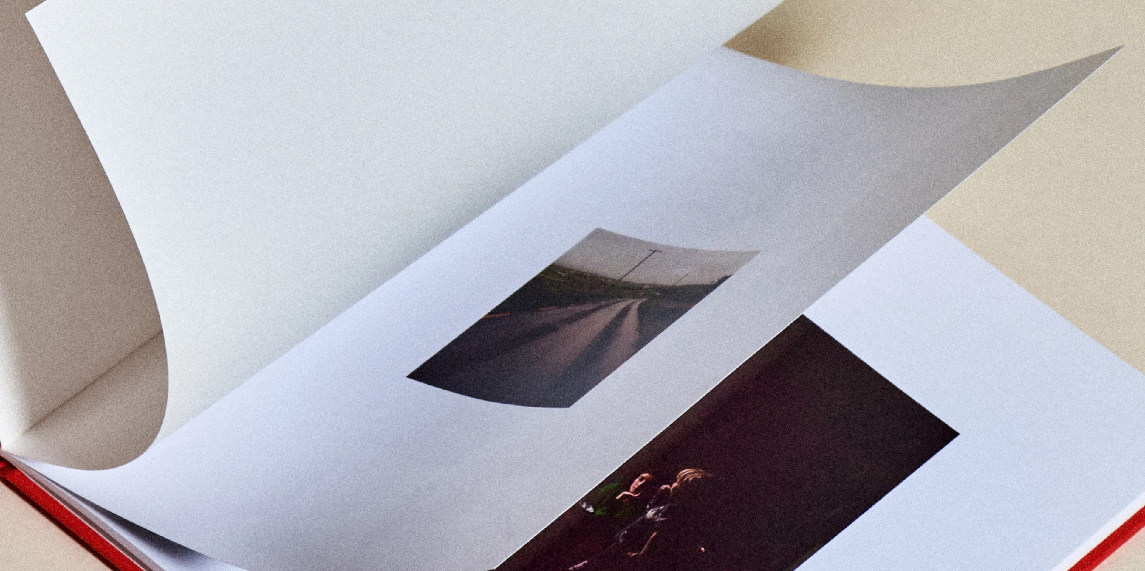

Creative Ways for Making a Photobook That Looks Like a Magazine
The default photobook is basically your phone camera roll with a cover on it. Everything in order, one photo per page, the same size throughout. More of a record than anything else. A magazine does something else. Someone decided what went in, how big it was, and what it sat next to. Here's our guide for designing your holiday photobook to look like a magazine. A 4-step guide, and none of them need design software.
Edit before you design
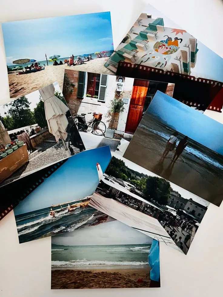
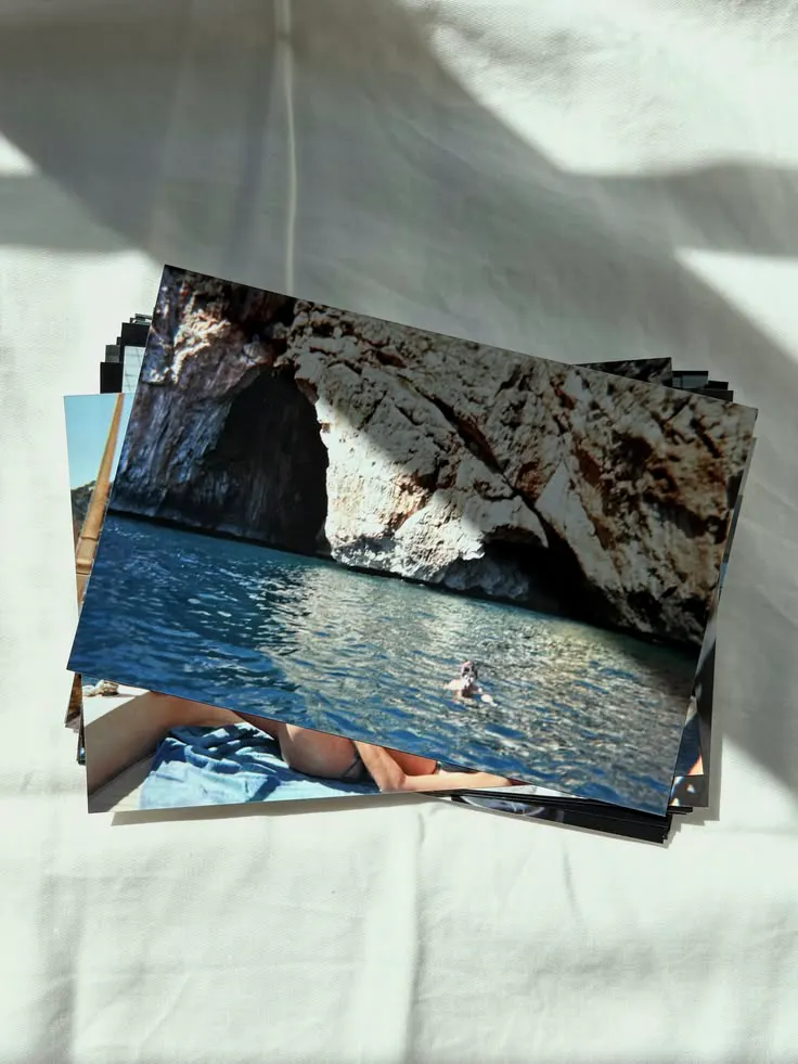
Edit down the pictures you actually want to use before getting started. Take out near-duplicates - you don't need 5 of the same view. Keep in key locations, and people. Tell a story.
Then decide what the first page is doing. Resist opening on your best photo. Open on the one that tells the reader where they are - the light, the colour, the weather. Save the best for the middle, where it lands harder.
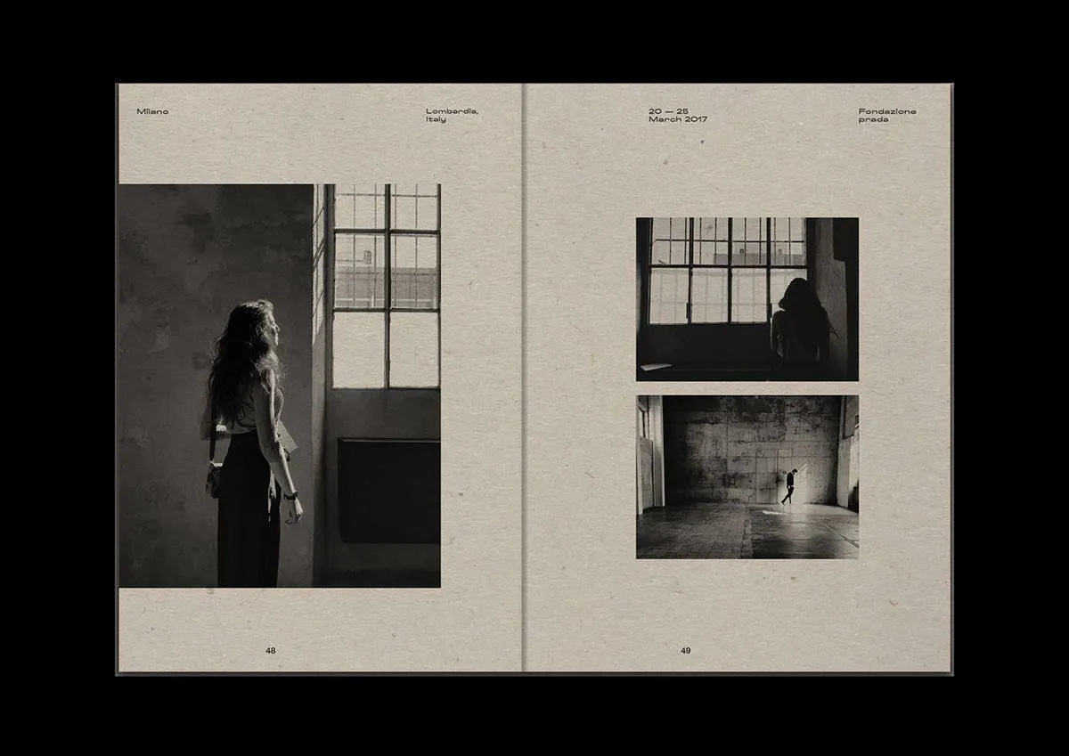
Vary the scale
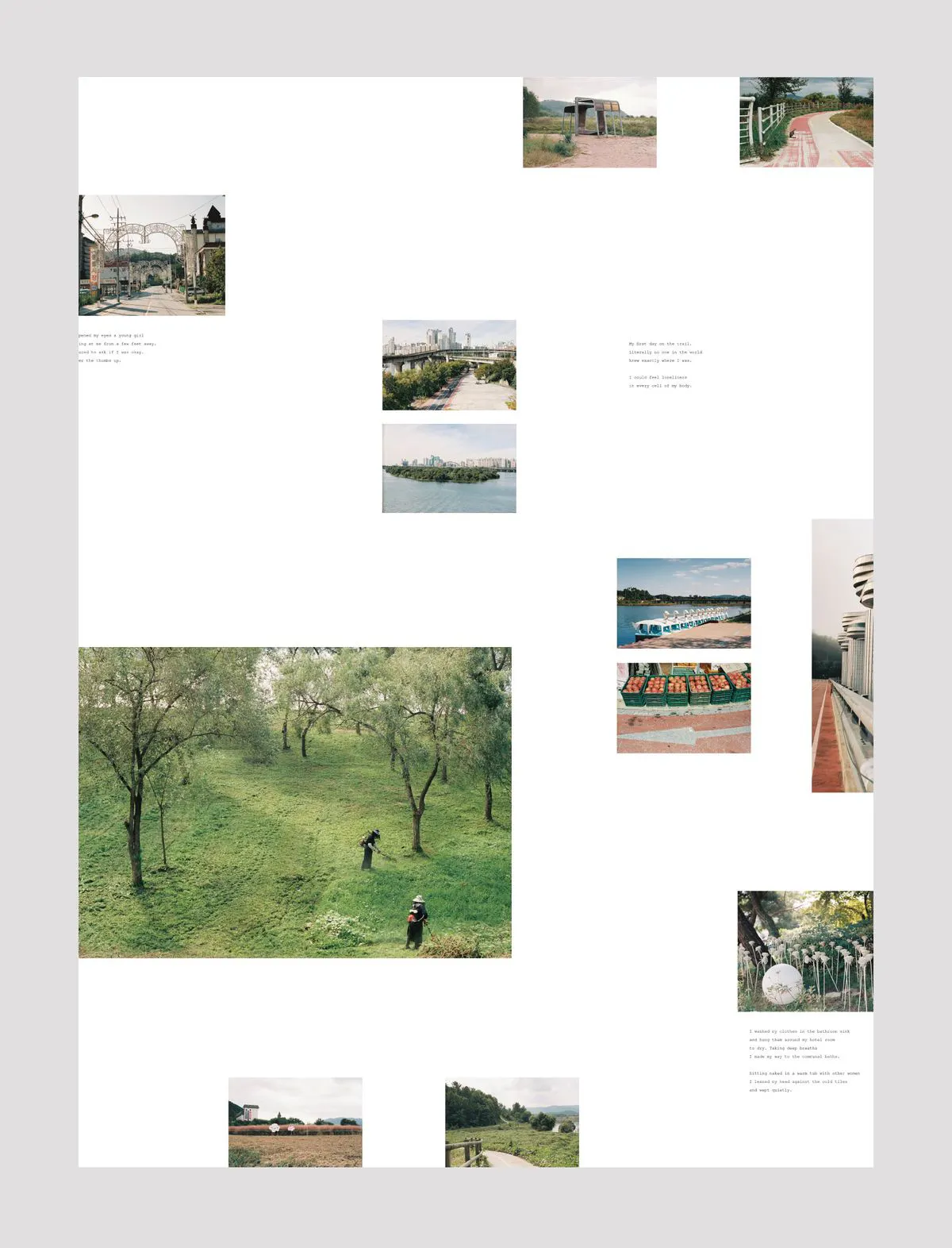
Set the margins once: the same distance from every edge, on every page, for the whole book. This is the change that makes a layout look considered, and it isn't the photos doing it - it's the white space around them. If an image runs to the edge, run it to all four. Half-measures read as mistakes.
Inside that, change pace constantly. Full-bleed, then a small square with air around it. Follow a wide landscape with a detail - a hand, a table, a doorway. The small photos do more work than you expect. And leave things out. A blank page is allowed, so is a page holding one photo the size of a stamp. If every page is full, nothing is emphasised and the book flattens.
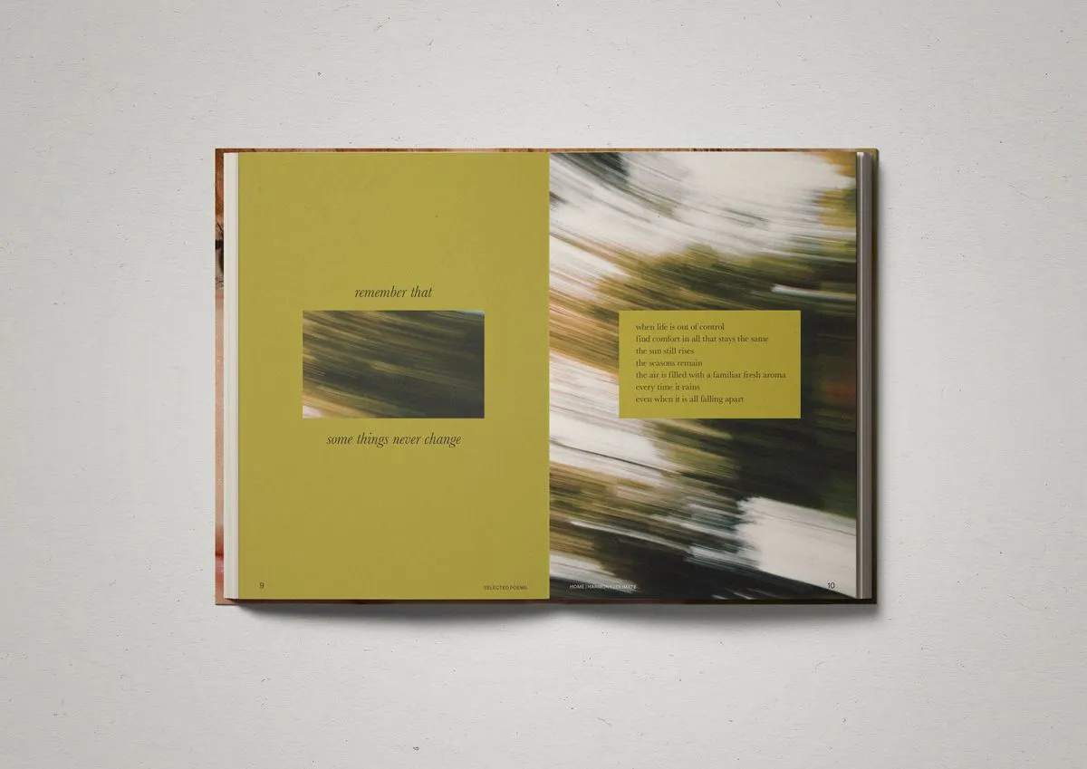
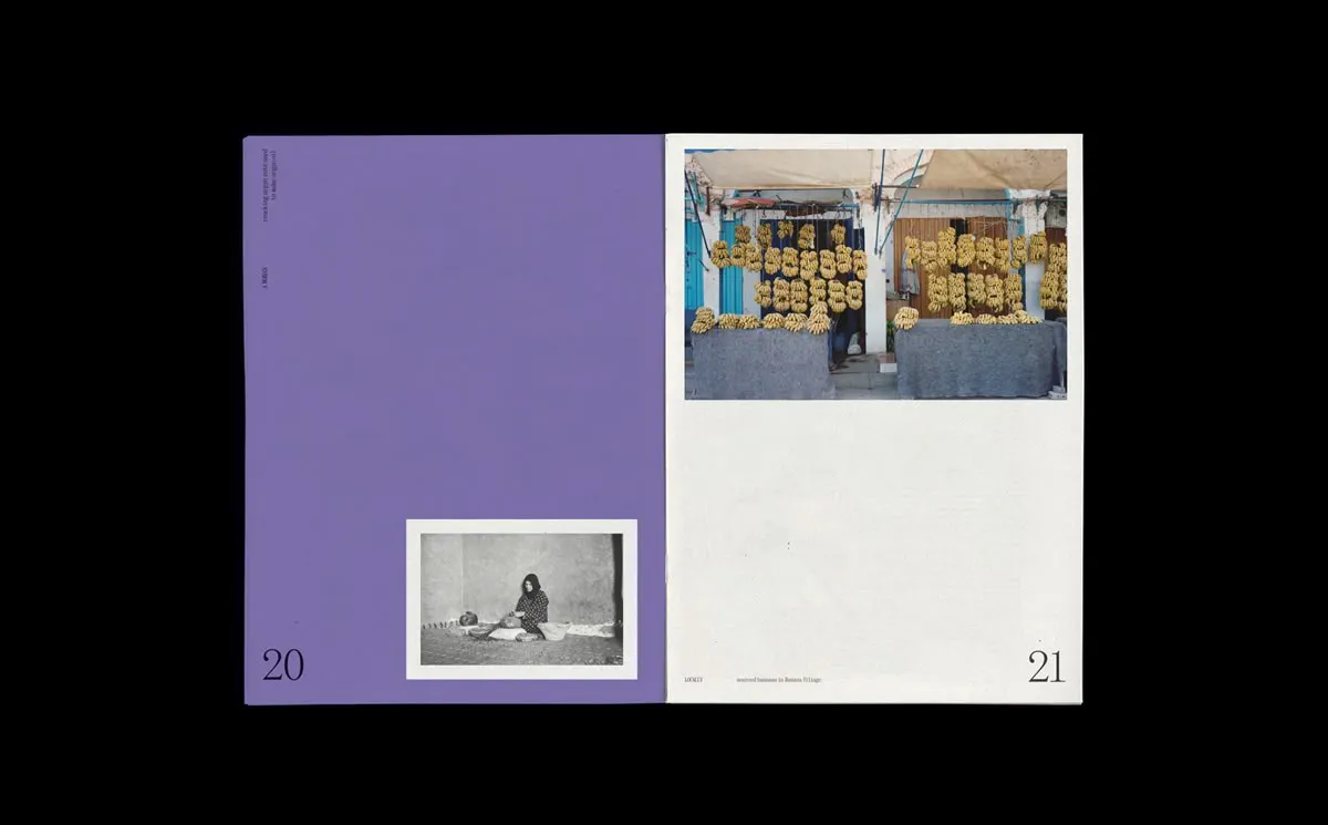
Think in spreads
Nobody sees one page. They see two, side by side, and the pairing is the design decision. Look at every spread as a unit and ask whether the two images are arguing. Two busy photos fight. One busy and one calm reads properly. Colour does the same work - green next to green is a spread, two unrelated colours is an accident.
Sequence in pairs and the ending sorts itself out. Chronology is the easy structure but it rarely closes well; the last day of anything is usually the dullest photo. End on the one that closes the feeling, not the calendar. Something empty, or something leaving. A road, a cleared table, a door.
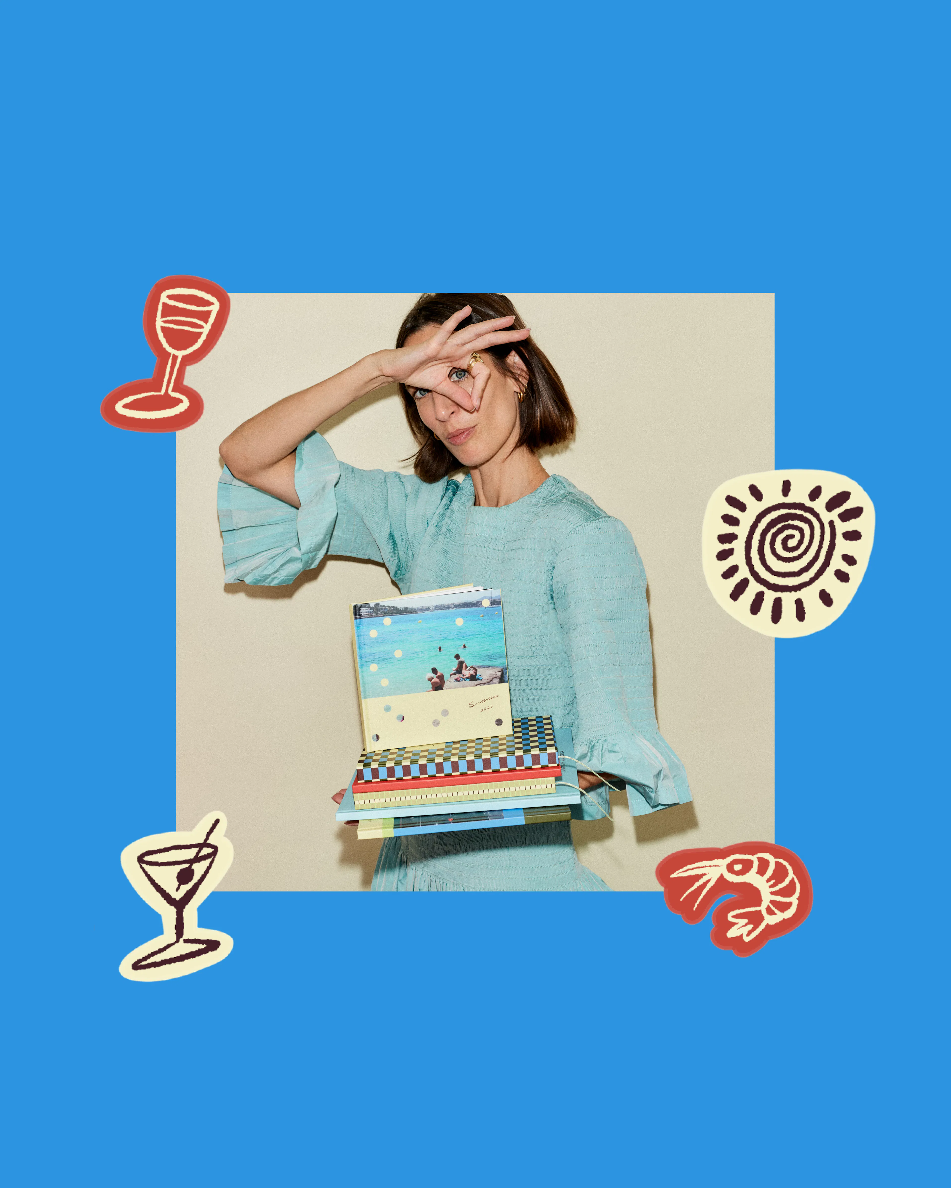
Add stickers and personality
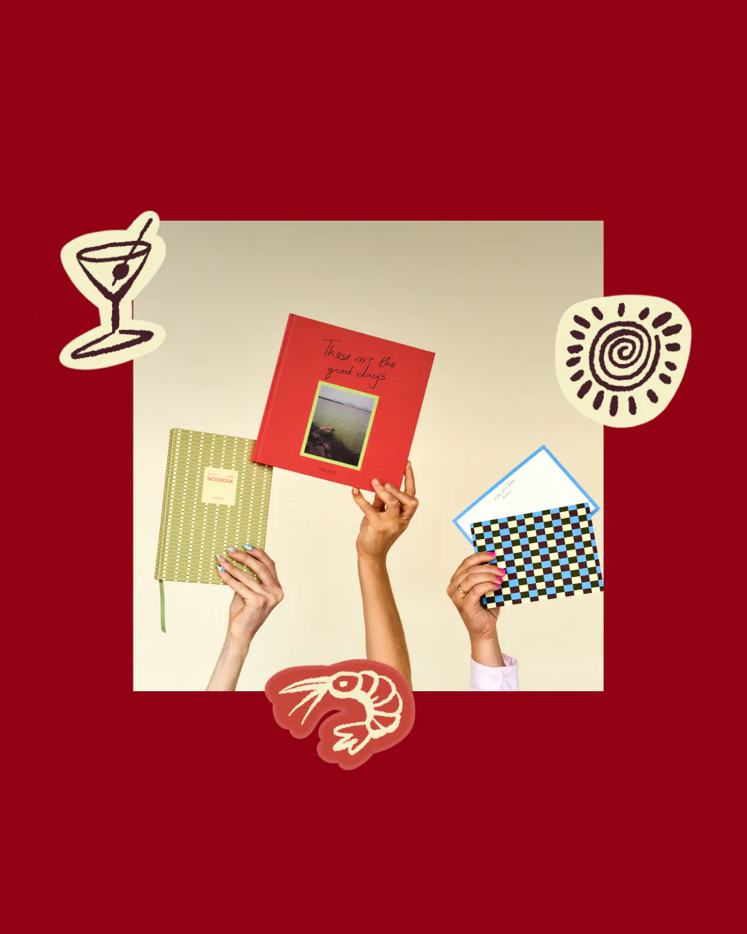
Magazines have running furniture: a page number, a rule, a mark that turns up in the same place every time. That's what stickers are for, and it's the opposite of how most people use them.
Pick one and use it as a system. A dot in the same corner of every right-hand page. A star to mark the start of each new place, and nothing else. One per spread, at most, aligned to the margin you already set. Scattered across a page they read as decoration. Used once, in a fixed position, they read as design. Save the rest for the inside back cover, where they can go down properly - the sheet of things that didn't make it in, stuck down all at once.
Captions are the other half of this. Not the date. Not the location, unless the location is the point. Write what you'd say out loud handing someone the photo: the name of the restaurant, what was ordered, who was late. One line each, set small, in the same position every time. Don't caption everything - three or four in a book of forty pages is enough.


